Photography composition refers to the arrangement of visual elements in a photograph, such as lines shapes, textures, colors, and pattern, to create a balanced and visually appealing image. It is an essential part of photography that can transform a good photograph into a better one.Here is a tutorial on composition in photography from basic to advance.
Composition in Photography | Basic to advance tutorial
Composition in photography is important because it can significantly impact the emotional response of the viewer to the image. A well-composed photograph can evoke emotions such as joy, sadness, curiosity, or awe, while a poorly composed photograph may leave the viewer feeling confused or disinterested. Moreover, good composition can help the photographer to convey their intended message more effectively, by directing the viewer’s attention to the subject of the photograph.
By using popular techniques such as the rule of thirds, leading lines, golden ratio,Symmetry,frame within frame and color, photographers can create effective compositions and produce outstanding images.
Did You Know?
Did you know that the word “photography” comes from two Greek words, “phos” meaning light, and “graphis” meaning drawing or writing? So, in essence, photography can be thought of as “writing with light”!
As a photographer, I believe that there is no single recipe for creating the perfect photograph. However, there are some guidelines that can certainly help you enhance the composition of your Images. In this tutorial, I will share some composition in photography techniques with you, starting from the basics and moving on to more advanced methods, complete with examples for each. The fundamental aspect of composition refers to how the different elements in a scene are arranged within the frame. Although these guidelines are not unbreakable rules, they have been used in art for centuries and can help in creating visually stunning compositions.let’s begin with the most well-known composition technique -The Rule of Thirds.
Rule of Thirds
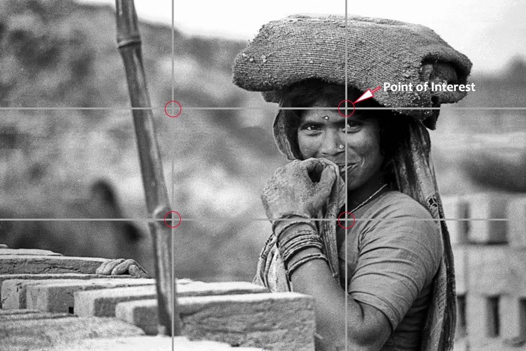
One of the most important things I focus on when capturing an image is composition. The composition of a photograph refers to the arrangement of elements within the frame, including the subject and any other elements in the scene. One composition technique that I always keep in mind is the Rule of Thirds. Trust me rule of third cover all of your 99% photographs. just follow this rule.
The Rule of Thirds is a basic principle of photography composition, which involves dividing the frame into three equal horizontal and vertical sections, creating nine equal parts(see above Photograph) . This grid pattern helps to create a balanced composition by providing a guideline for placing the subject and other important elements in the scene. The four points where the lines intersect are known as point of interests, and these are where you should aim to position your subject or other points of interest.
To apply the Rule of Thirds, you first need to visualize the grid on your viewfinder or screen, and then position your subject or other important elements along the lines or at the power points. For example, when taking a portrait, placing the subject’s eye along one of the vertical lines can make for a more striking composition.
While the Rule of Thirds is just one of many composition techniques, it’s an important principle to keep in mind when taking photographs. It can help to create a more visually balanced and aesthetically pleasing composition, and it’s a great way to take your photography to the next level. So, next time you’re taking a photo, remember to apply the Rule of Thirds and see how it can improve your composition.Happy shooting.
Leading Lines
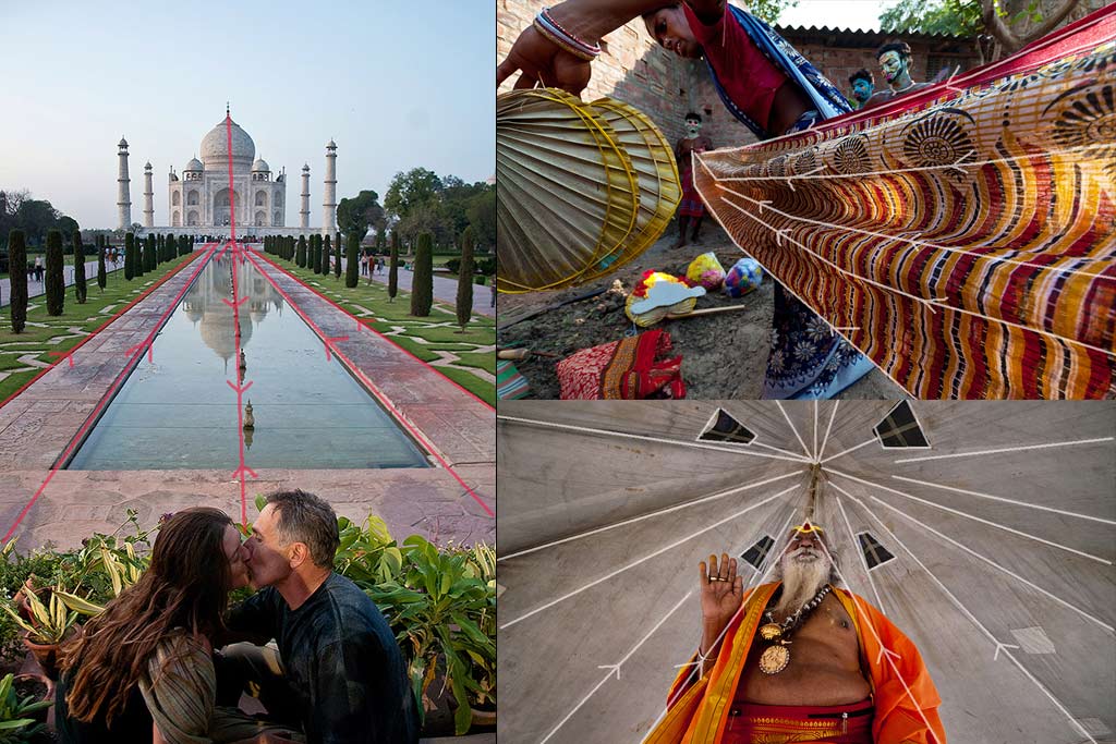
One composition technique that I frequently use is the concept of leading lines.
Leading lines are lines within a photograph that help to draw the viewer’s eye towards the main subject or point of interest. These lines can be either straight or curved and can be found in many different forms, such as roads, fences, tree branches, or even shadows. The purpose of leading lines is to guide the viewer’s eye through the photograph and towards the subject, creating a sense of depth and visual interest.
To use leading lines in your photography, first look for natural or man-made lines within the scene. Position yourself in a way that allows the lines to guide the viewer’s eye towards the subject, and then use the lines to create a sense of movement and depth within the photograph. You might use a road or pathway to lead the viewer’s eye towards a distant mountain range or use a bridge or building to create a sense of perspective within the scene.
When using leading lines, it’s important to consider the composition of the photograph as a whole. The lines should not detract from the main subject or appear cluttered . Instead, they should complement the subject and help to create a balanced and visually engaging composition.
Symmetry and Asymmetry

I know that composition plays a vital role in creating visually compelling images. One way to achieve a well-balanced composition is by using the principles of symmetry and asymmetry balance.
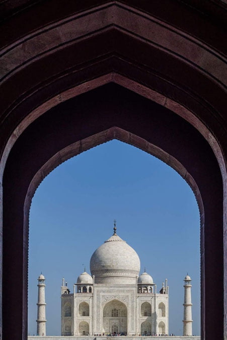
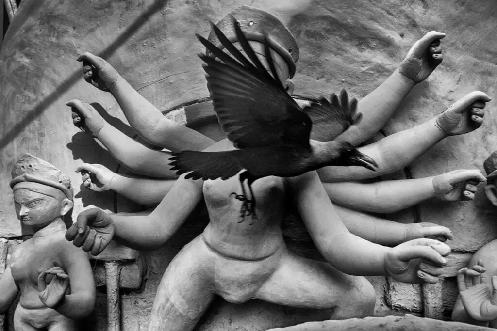
Symmetry balance refers to a composition where the visual elements are evenly balanced on either side of an imaginary vertical or horizontal line. A classic example of symmetry balance is a reflection in water, where the visual elements on one side of the image are mirrored on the other side. This creates a sense of harmony and stability in the image.Another example, if you divide above or below photographs vertically from middle ,its almost a mirror image.
Asymmetry balance, on the other hand, refers to a composition where the visual elements are not evenly balanced on either side of an imaginary line. Instead, the elements are arranged in a way that creates a visual tension and energy within the image. For example, an image that has a large subject on one side of the frame and a smaller subject on the other side can create a sense of balance and interest in the composition.
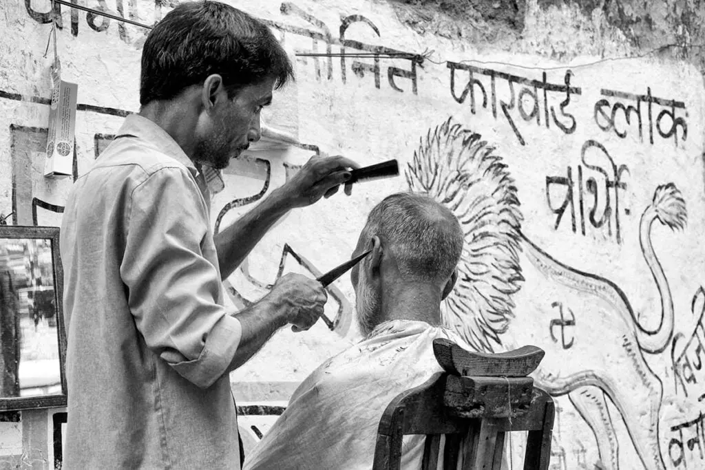
When using symmetry and asymmetry balance in photography, it’s important to consider the subject and the story you’re trying to tell. Symmetry balance can work well for landscapes or architecture, while asymmetry balance can be effective for portraits or street photography. Experimenting with different balance techniques can help you create unique and interesting compositions that capture the viewer’s attention.

Use of foreground and depth
As a photographer, I have come to realize that adding foreground interest and depth to an image can make it more appealing and engaging to the viewer. The use of foreground and depth in photography can create a 3D effect and give the viewer the sense of being present in the scene.
To use foreground interest and depth in photography, it’s important to consider the scene and the elements within it. Look for interesting foreground elements that can add depth and texture to the image. Experiment with different apertures to control the depth of field and create a 3D effect. Remember that the goal is to create an image that not only captures the scene but also engages and immerses the viewer.

When it comes to capturing a scene, a photograph is limited to two dimensions. This can sometimes make the image look flat and lacking of depth. That’s where the technique of adding foreground interest comes into play. By including an interesting foreground element in the shot, you can create a sense of depth and give the impression that the viewer is looking into the scene, rather than just at it.
Adding foreground interest and depth to an image can take it to the next level. It creates a 3D effect and gives the viewer a sense of being present in the scene. By experimenting with different elements and apertures, you can create visually stunning and engaging photographs that will captivate your audience.
Frame within Frame
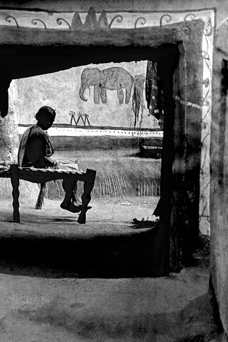
The “Frame within Frame” composition is when you create a “picture within a picture” by using an object in the foreground to frame the main subject in the background.
This technique adds depth and interest to your photos, and it can draw your viewer’s eye to the main subject. The object used to frame the subject can be anything – a window, a doorway, an arch, or even natural elements like trees or bushes. Using this technique creates a sense of depth and adds layers to your image, making it more visually engaging.
When using the Frame within Frame technique, it’s important to pay attention to the position of the foreground object. The object should not overpower the subject in the background, but rather complement it. The foreground object should also be sharp and in focus, as it’s an essential part of the composition.
The Frame within Frame composition is a popular technique in architecture and landscape photography, but it can be used in any genre of photography. With this technique, you can create stunning and dynamic images that tell a story and capture your viewer’s attention. As a photographer, it’s essential to experiment with various composition techniques, including Frame within Frame, to improve your skills and capture breathtaking photos.
Repetition of pattern and Elements
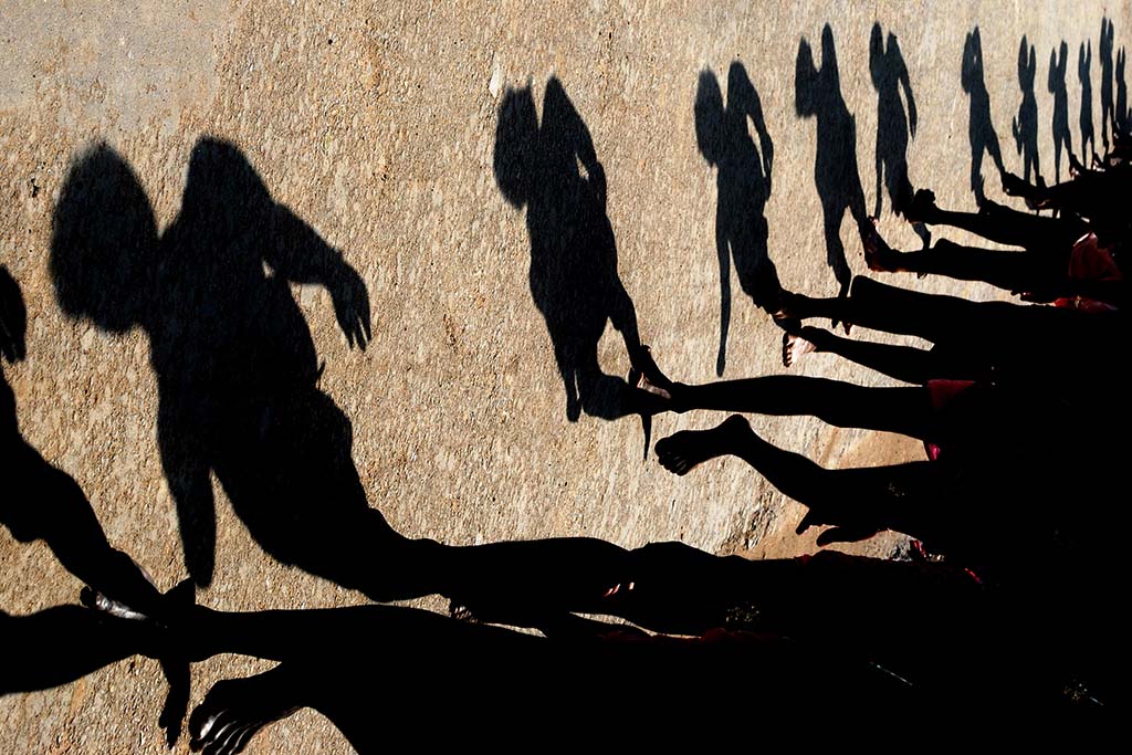
Pattern and repetition are powerful tools for creating interesting and visually pleasing compositions in photography. Patterns are made up of repeating elements that create a sense of unity and cohesion within an image. Repetition refers to the use of identical or similar element s that are arranged in a recurring manner within an image.
In photography, patterns and repetition can be found in a variety of subjects, such as architecture, nature, and street photography. They can be used to create a sense of rhythm, harmony, and movement in a photograph. For example, a series of lamp posts or trees lining up along a path can create a strong sense of repetition and lead the viewer’s eye through the scene.I the above shot,you will find that shadows creates a beautiful pattern and put a rythm in the photograph.
One effective way to use patterns and repetition in photography is to fill the frame with the repeating elements. This can create a striking and dynamic visual impact. Another approach is to use patterns and repetition as a background or supporting element for a subject, which can add depth and interest to the image.
When using patterns and repetition in photography, it’s important to pay attention to the spacing and arrangement of the repeating elements. Adjusting the distance between the elements or their orientation can create different visual effects, such as emphasizing the pattern or breaking it up.
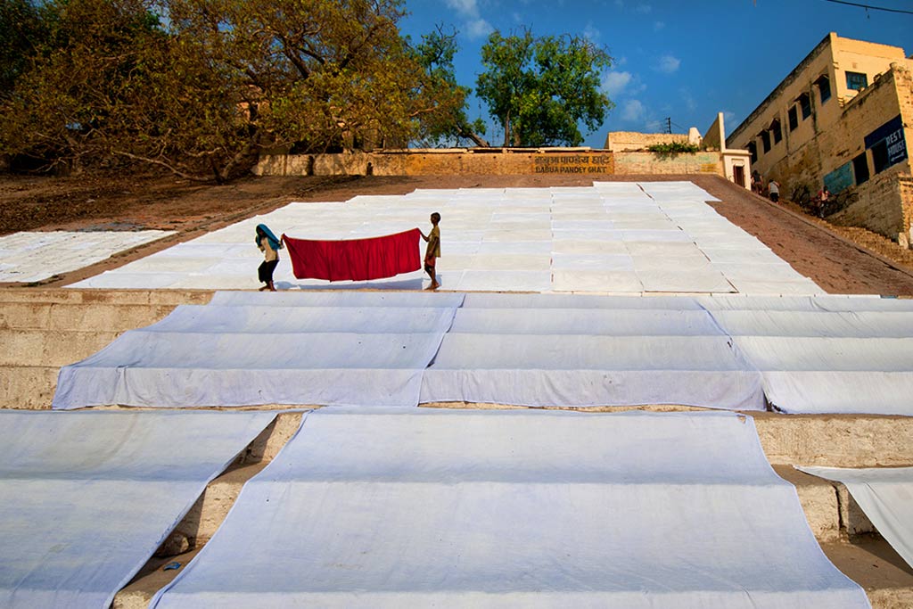
Negative space in photography

Negative space, also known as white space, is the area around and bet ween the subjects in a photograph. It is the empty or neutral space that surrounds the main subject, and it can be just as important as the subject itself in creating a visually compelling image.
Negative space can be used in a variety of ways to enhance the composition of a photograph. It can be used to provide breathing room and create a sense of balance in the image. It can also be used to draw attention to the subject by providing a contrast between the subject and the surrounding space
When using negative space in your photography, it’s important to consider the placement of the subject within the frame. Placing the subject off-center and using negative space to balance the image can create a more dynamic and interesting composition.
Negative space can also be used to tell a story or convey a mood in your photographs. Using negative space to create a sense of isolation or loneliness can evoke a feeling of sad ness or contemplation, while using negative space to create a feeling of openness and freedom can convey a sense of hope or possibility.
In order to effectively use negative space in your photography, you must learn to see beyond the subject and pay attention to the surrounding space. Take the time to experiment with different compositions and positioning of the subject in relation to the negative space.
****Although sometimes we intentionally keep some blank spaces as known as “copy space”.
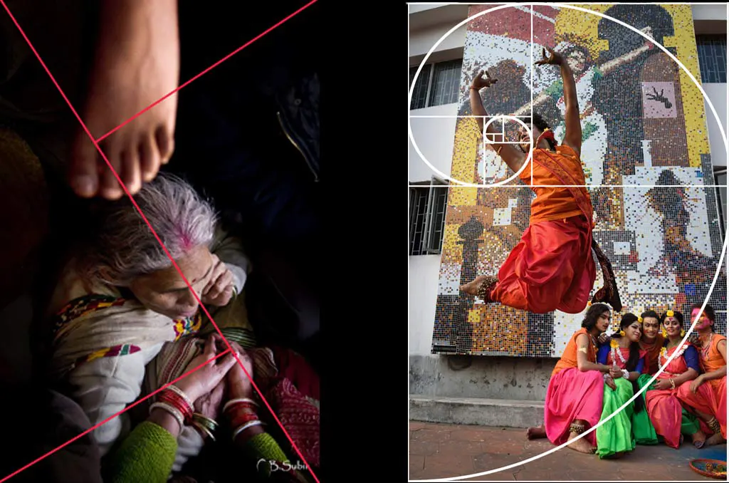
Golden Triangle
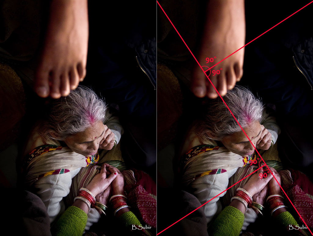
Understanding composition in photography is crucial for creating visually striking and balanced images. One compositional technique that can be used is the Golden Triangle.You can say it is rule of thumb in visualize a composition
The Golden Triangle rule creates a triangle shape within the frame, with two equal sides and one longer side. This is achieved by dividing the frame diagonally and then bisecting the dia gonal line from the other two corners.
By following the Golden Triangle rule, photographers can create a sense of balance and movement within their images. The subjects/area of interest should be placed at the points of intersection or within the triangles created by the lines. This creates a dynamic composition that draws the viewer’s eye towards the main subject while also creating a sense of movement and flow within the image
Using the golden triangle in photography can help photographers create images that are not only aesthetically pleasing but also have a strong visual impact. This compositional technique is versatile and can be used in a variety of photographic genres.
Fibonacci Spiral & the Golden Ratio
One of the most intriguing composition techniques that I have come across is the Fibonacci Spiral and the Golden Ratio.
The Golden Ratio is a mathematical concept that has been used in art and architecture for centuries. It is a ratio of approximately 1:1.618 and is believed to be the most aesthetically pleasing proportion in design. The Fibonacci Spiral, also known as the Golden Spiral, is a spiral that grows using the Golden Ratio. It is created by starting with a square and then adding a smaller square that is based on the Golden Ratio to the original square. This process is then repeated to create a spiral.We will discuss it elaborately later in another post.
In photography, the Fibonacci Spiral and the Golden Ratio can be used to create visually pleasing compositions. The spiral can be used to lead the viewer’s eye through the image, while the Golden Ratio can be used to balance the elements in the scene. For example, the subject of the photo can be placed at the intersection points of the Golden Ratio grid to create a more harmonious composition.
It is important to note that while the Fibonacci Spiral and the Golden Ratio can be powerful tools in composition, they are not strict rules that must be followed. It is still important to consider the overall balance and harmony of the image, as well as the subject and the message that the photograph is meant to convey.
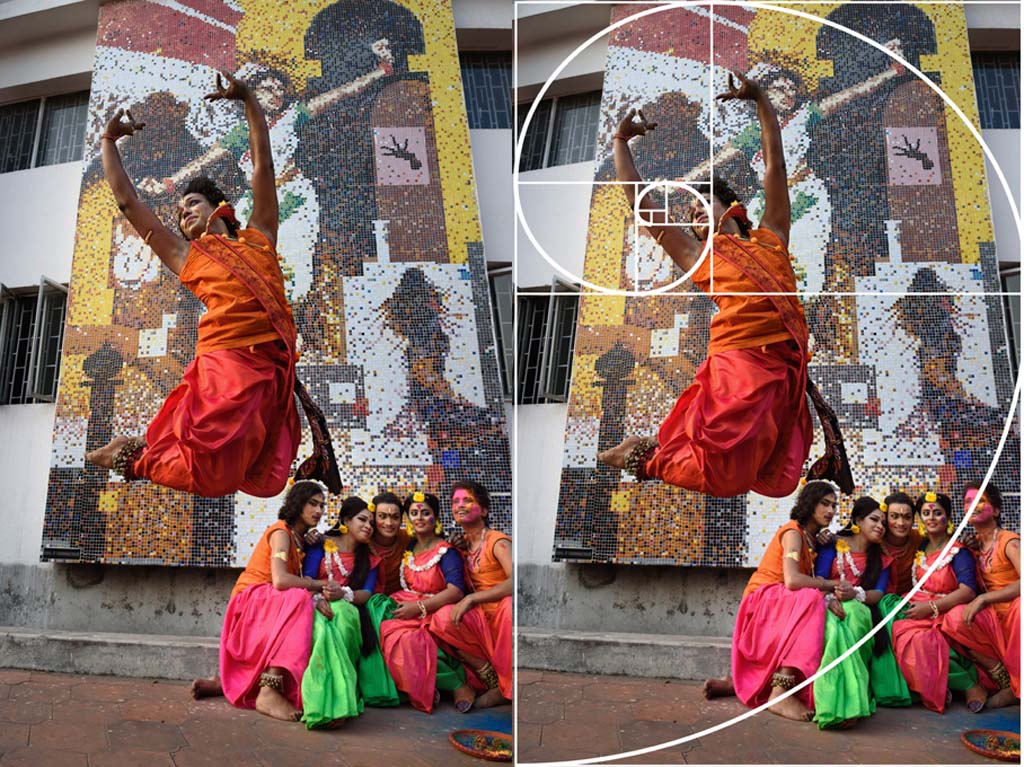
- Is Fibonacci Spiral & the Golden Ratio same?
The Fibonacci spiral and the Golden Ratio are two powerful tools that photographers can use to create compelling compositions. While they are related, they are not the same thing, and it’s important to understand the difference between the two. The Golden Ratio is a mathematical concept that has been used in art and design for centuries. It is based on the ratio of 1:1.618 and is found in nature, architecture, and other fields. When used in photography, it can help create a pleasing and balanced composition that draws the viewer’s eye to key elements within the frame
The Fibonacci spiral, on the other hand, is a visual representation of the Fibonacci sequence, a mathe matical concept that is closely related to the Golden Ratio. It is created by drawing a series of quarter circles inside squares, with each square being based on the sum of the previous two squares. While the spiral is not always based on the Golden Ratio, it is still a useful tool for creating visually interesting and balanced compositions in photography.
Incorporating the Golden Ratio or Fibonacci spiral into your photography can help you create a sense of harmony and balance that is pleasing to the eye. By understanding how these tools work and practicing their use in your compositions, you can create photographs that are both visually stunning and emotionally compelling. So whether you are an experienced photographer or just starting out, take the time to learn about the Golden Ratio and the Fibonacci spiral, and start incorporating them into your compositions to take your photography to the next level
Keep in mind
While composition rules and techniques are important for creating visually appealing images, it’s important to remember that as a photographer becomes more experienced, they may find themselves deviating from these guidelines. As your eye develops, you may find that you rely less on strict rules and more on intuition and personal style. Rules become fluid and breaking them can become necessary to achieve the desired effect.
However, it’s important to have a solid understanding of these principles to effectively use them in your work, whether you choose to adhere to them or not. Ultimately, the goal of composition in photography is to create compelling images that capture the attention of the viewer and communicate the inte nded message or emotion.
Last but not least
- Elevate your photography by layering your photographs. Experiment with different angles and perspectives to add depth and complexity to your images
- Don’t be afraid to fill the frame with your subject. It’s a great way to capture the essence of the scene and draw the viewer’ s attention to the details that matter.
- Walking is an essential part of street photography. It allows you to explore new neighborhoods, discover hidden gems, and find unexpected photo opportunities.
- Failure is a natural part of the creative process. Accept that not every shot will be a masterpiece, and use your mistakes as an opportunity to learn and improve.Realize 99.9% of street photography is failure.
- Projects give your photography focus and purpose. Choose a theme or subject that inspires you, and dedicate time to capturing it from different angles and perspectives.
- Don’t be afraid to try new things. Experiment with different techniques, equipment, and styles to push your creativity and challenge yourself.
- Follow your passion and capture the subjects that speak to you. When you’re passionate about your work, it shows in your images and can lead to more meaningful and impactful photography.
- Photography is not just about capturing images, but also the emotions and stories behind them. Look beyond the surface and try to capture the essence of a place or moment.
- Traveling can open up new perspectives and inspire your photography. Don’t limit yourself to your local surroundings. Explore new cultures, people, and places to expand your creativity and understanding of the world.

Very well narrated with examples. Hope this will serve as a handy guide to the greenhorn aspiring photographers.
Thanks a lot for your comment.
Such an wonderful and elaborated write up along with examples of your works. It helps a lot for the newcomers and budding photographers. To me, I started visiting Gangasagar since last 3 years, mainly after going through your stupendous works, and it is unparallel. Others works are just unputdownable.
Thanks Nilanjan for your comment. Best wishes.